Brand
The Gnosis visual identity
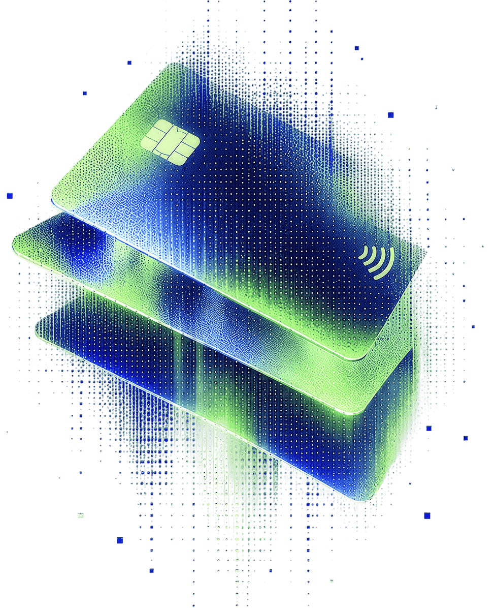
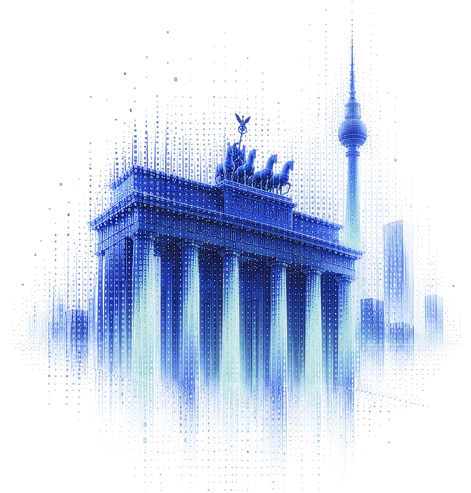
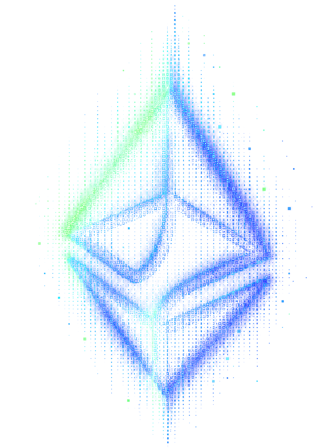
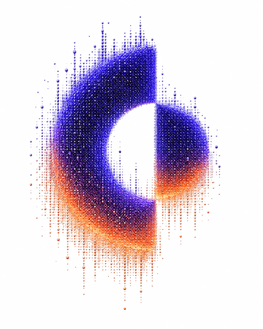
One system, four products. Gnosis Pay, Gnosis Chain, the Ethereum Economic Zone and Circles each carry their own accent, but the same ink, the same Playfair headline, and the same dissolving dot-matrix illustration underneath.
Logomark
Gnosis, and its products.
The Gnosis logo integrates the owl directly into the wordmark, replacing the “O” as a structural part of the name rather than a separate symbol. It functions as a single, unified signature — the owl is never removed, substituted, or repositioned.

Colour
Primary
Colour
Secondary
Gradients · New in v4
The soft washes behind every section.
Five vertical gradients carry the v4 pages — a hero version and four quieter section washes, all resolving to Tint. They diverge from the guidelines' canonical web-hero recipe, monochrome-purple-smooth, which runs a dark Purple 1000 → Purple 50 ladder instead of this light, pastel one.
Typography
One serif for headlines, one sans for everything else.
Playfair Display carries every heading on the site, from the hero down to a card title. Inter runs the body copy, the kickers, and the interface — buttons, dates, tags, menus.
Illustration
Solid forms, dissolving into dots.
Every hero and card illustration is built the same way: a single recognisable object rendered as a dense field of small rounded dots that thins out at the edges and trails downward, like pixels raining out of the shape. Each product's own accent colour glows at the base.